

Noam Rosenbaum and Prof. Yoram Louzoun
Abstract
One of the most important questions in the COVID-19 pandemic is the origin of the differences between countries’ spread of COVID-19. Many claims have been made, but few are supported by data. In this post, we will describe a model that attempts to link the characteristics of a country with its mortality rate from COVID-19. To correlate observations with the difference between countries, we have collected in parallel:
1. The number of deaths from COVID-19 every day for 109 days.
2. 27 characteristics of the countries, such as population density, median age, and more.
In the first stage, the countries were divided into different groups (clustering) according to their pattern of mortality from COVID-19. In the second stage, the countries were classified with a 90% accuracy on the test set into the different groups defined in the first stage, according to each country's characteristics.
The results are surprising. The characteristic that predicts most the mortality from COVID-19 is the obesity rate in the country and, following it, is the democracy index in the country. Similarly, longitude and average life expectancy are important characteristics. Most of the active characteristics that countries are implementing, such as a lockdown, do not seem to have much impact.
The results could imply that the general health of the public is more important in controlling the spread of the disease than any active actions the government takes.
Data
For the purpose of analysis, we used two datasets:
1. COVID-19 characteristics — Information regarding verified and deceased patients from COVID-19 in each country from December 31, 2019, to August 20, 2020:
‣ The number of verified patients found that day
‣ The number of people who died that day from COVID-19
‣ The total number of patients up to that day
‣ The total number of deaths up to that day
For each country, we define the first day with 5 deaths in total as the first day (t0) to have a time series of COVID-19 death with the same starting conditions for all the countries.
2. Countries characteristics — 27 Features were used (23 at first, and 4 were added later). The information was taken from multiple sources (see links at the end). The first 23 features are:
| Feature | Description |
| Is lockdown | Has a quarantine been enforced in the country? Possible values: 0, 1. |
| No. of days 5 deaths to lockdown | The number of days from t0 to the first day of quarantine. This feature can also accept negative values in cases where the quarantine was activated before 5 deaths were recorded in the country. |
| Literacy (%) | The percentage of people who can read in the country |
| Population | The country's population |
| Population density | Population density |
| Median age | Median age |
| Aged 65 older | The percentage of people in the population over the age of 65 |
| GDP per capita | GDP — gross domestic product per capita |
| Hospital beds per thousand | Hospital beds per 1,000 people |
| Latitude | Latitude |
| Longitude | Longitude |
| Death by lack of sanitation | The number of people who have died as a result of lack of sanitation to 100,000 people in the country in 2016. |
| Stringency index | A weighted measure of the severity of the restrictions and intervention actions taken by the country as a result of the COVID-19 each day (e.g., quarantine, mask-wearing duty, closing schools, closing borders, etc.). |
| Cvd death rate | Death from heart disease |
| Diabetes prevalence | Incidence of diabetes in the population |
| Life expectancy | Life expectancy |
| Democracy score | Democracy index; an index between 0 and 10 where 10 is a full democracy and 0 is a full dictatorship |
| Electoral process and pluralism | Democracy index; the country's electoral process |
| Functioning of government | Democracy index; checks the conduct and functioning of the government |
| Political culture | Democracy index; measures the people's trust in government, obeying state laws, and guidelines |
| Civil liberties | Democracy index; measures individual freedom and freedom of expression |
| Obesity rate | Obesity rate |
The variance in the mortality pattern from COVID-19 among different countries
There are significant differences in mortality from COVID-19 among different countries. Because the number of verified patients in the country is affected, among other things, by the number of tests and the policy of testing in the country, we have concentrated on the number of deaths.

Clustering countries according to their mortality spread patterns
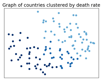
To represent the countries, their connections, and later cluster them, we have constructed a mathematical graph in which each node is a country and each edge between 2 countries has a weight that represents how similar the two countries are in terms of the pattern of mortality from COVID-19. To calculate the weight between 2 countries, we computed the distance between the countries, and the weight is proportional to the inverse of the distance. The closer the two countries are in the graph, the greater their similarity. We will use the Louvain method to identify communities in the graph to find the different groups.
Finally, each country is colored according to the group to which it belongs in the graph:
Another way to view the groups we received is to display a graph of cumulative mortality log across the timeline and color each country according to the group to which it belongs:
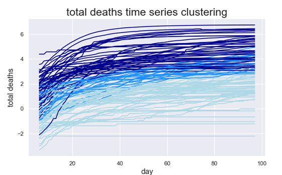
Here, too, one can see that the clustering phase has created a good separation between the different countries; the darker the blue, the faster the rate of per capita mortality spread from COVID-19 in the country.
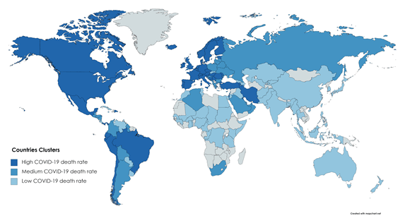
Another way to present the cluster is to color the countries of the world according to the group to which the country belongs:
Classification
After we found the group to which each country belongs in terms of its COVID-19 mortality spread, we built an unsupervised machine learning model (XGBoost) to predict the group each country belongs to based on its characteristics — the population, the government, and the intervention actions taken against COVID-19. The model reaches an accuracy of 0.9 on a test set giving three groups for the classification.
We separated the countries into training and test sets in a 75%–25% random division. To improve the model, we chose the features with the best prediction accuracy. To do this, we used the Forward Selection method. In this method, we start with a model without any features. Then we try each feature, pick the one with the best accuracy score, and add it to the model. We do that again and again until the features we have not added yet do not improve the model accuracy.
After implementing this method, four leading characteristics were found: GDP per capita, longitude, obesity rate, and political culture.
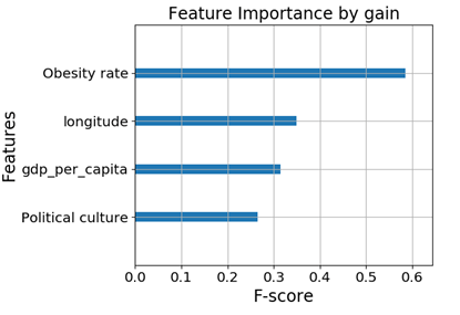
One can see in the chart that the obesity rate contributes more than the others, while the other three features contribute roughly equally.
To visualize how each property contributes to prediction, we will use a dimension reduction method called UMAP — Uniform Manifold Approximation and Projection for Dimension Reduction. This method shows high dimensional datasets on a 2D plot according to the similarity between every 2 countries. That is, similar countries will be close on the graph:
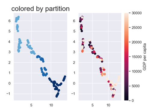
One can see that many countries with a rapid mortality rate from COVID-19 are also countries with high GDP. This fact is surprising because our first intuition is the richer the country, the better it can provide its citizens with educational and medical resources to prevent the spread of COVID-19 and save lives, for example, by ventilators. Our theory is the richer the country, the more movement of people occurs within it, which causes the disease to spread faster.
For example, there are places in Africa that are not connected to other places well enough to spread or even hear about COVID-19.
To test this theory, we added 4 additional characteristics:
1. Total tourists — The total number of tourists entering the country per year.
2. Tourists per capita — The number of tourists entering the country per year divided by the country's population.
3. Total air passengers — The number of people flying into the country and within the country.
4. Air passengers per capita — The number of people flying into the country and within the country divided by the country's population.
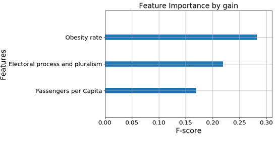
If the theory is correct, adding these features should replace the feature GDP per capita with one of them. Indeed, after re-running Forward selection, the following features were selected:
Obesity rate, electoral process and pluralism, passengers per capita
Almost the same characteristics were obtained as before:
1. Obesity remains.
2. The electoral process and pluralism feature is a measure of democracy in the country and is similar to the political culture feature selected before.
3. Passengers per capita replaced GDP per capita.
The graph of feature importance with the new selected features:
We will now show each feature by a UMAP as was done with GDP per capita before:
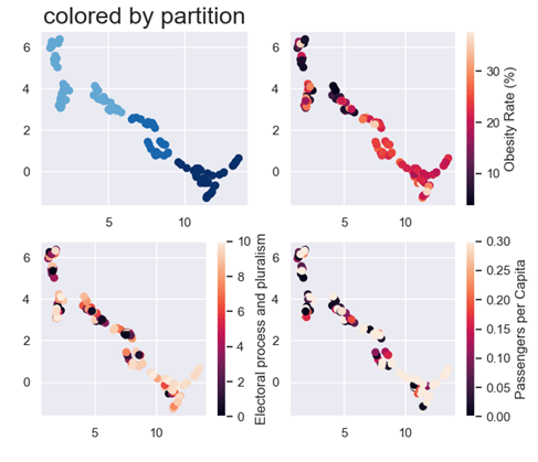
The UMAP of obesity rate that is in the top right shows a great separation between countries with low to high mortality spread rate. This shows that the obesity rate is a good predictor, just as we saw in the feature importance plot. The reason behind it is that obesity is considered to be a background disease that increases the chances of a person infected with COVID-19 dying. That is, a person with a weight above average who is infected with COVID-19 is more likely to die from it than a person with a normal weight infected with COVID-19. The graph on the bottom left is a democracy index that describes how democratic the election process is in the country. In the UMAP of the passengers per capita feature (bottom right), one can see that the faster the mortality rate, the higher the number of people flying in and out of the country. The reason for this is that the main cause of the disease infection resulting in death from the disease is people moving from place to place.
Stability Analysis
To check the stability of the model, we computed the feature importance graph for 3, 4, and 6 clusters. The importance of each feature (F-score in the graph) was calculated by the Gain method. This method computes the score relative to the number of times the feature split the decision tree of the model. (This number is an estimate of how much the feature improves the prediction accuracy).
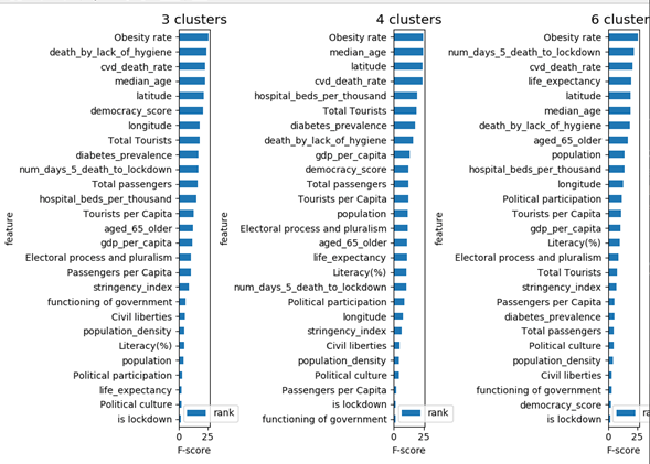
In the three graphs, the highest score is Obesity rate. Note that this feature is also at the top of the feature importance graph with the three selected features. The feature "is lockdown" is the least important feature in all three graphs. This means that the question of whether the country has enforced a lockdown does not contribute to the ability of the model to predict accurately. There are slight differences between the 3 graphs, but the model is stable.
Conclusions
One of the most important questions in the current pandemic is what the reasons for the differences between countries are. These differences are important to understand which countries we can compare ourselves to and to understand what affects the spread of the disease. We suggested here a simple method to define the source of the differences:
1. Characterize each country according to its mortality spread rate
2. To cluster the countries into groups with similar dynamics
3. Use machine learning to predict cluster association using the countries' characteristics
The results are surprising. Characteristics we did not expect to have any influence like obesity resulted in being the most affecting feature. Features that we thought would have an effect, like the percentage of people over the age of 65 (since most of the people that died from COVID-19 are at that age range) did not have an effect at all. In addition, actions that a country takes to control the spread of the disease like a lockdown do not seem to have any effect on the prediction ability of the model.
Although the results do not show causation, we can speculate that the measures to control the spread of the next pandemic are to maintain general public health rather than take direct actions to prevent the spread.
Links
1. Link to the Github repository of the project with the code and data sets used for analysis: https://github.com/Nohamika/Nohamika.github.io
2. Link to the data set of the number of deaths every day from COVID-19 in each country: the world: https://ourworldindata.org/coronavirus
3. Links to sources with the countries' characteristics:
3.1 Democracy Index — https://en.wikipedia.org/wiki/Democracy_Index
3.2 Passengers per Capita — https://www.citypopulation.de/en/world/bymap/AirTrafficPassengers.html
3.3 Lockdown — https://en.wikipedia.org/wiki/National_responses_to_the_COVID-19_pandemic
3.4 Longitude and Latitude — https://developers.google.com/public-data/docs/canonical/countries_csv
3.5 All other properties were taken from https://ourworldindata.org
4. Hyperparameter tuning: https://www.kaggle.com/tilii7/hyperparameter-grid-search-with-xgboost
Noam Rosenbaum works in the field of data science.
Prof. Yoram Louzoun specializes in epidemiology and mathematical immunology, stochastic processes, and graph theorization.

אתם חייבים להיות מחוברים על מנת לשלוח תגובה.